An Element Location-Based Approach for Responsive Design Testing

In today's fast-paced world, we rely on our smartphones and tablets to access information quickly and easily. As a result, it's no longer enough for website owners to ensure that their websites look good on a computer screen alone. In fact, with more people accessing the internet via mobile devices, it's essential for websites to be optimized for smaller screens.
In this blog post, we'll delve into the importance of responsive design testing and explore an element location-based approach. By testing your website's responsiveness and ensuring that it displays correctly on various mobile devices, you'll be able to improve your website's accessibility and user-friendliness. So, let's explore how responsive design testing can benefit your website and how an element location-based approach can help you optimize your website for mobile devices.
Responsive Design Testing Scope
Responsiveness testing in quality assurance typically involves testing how a web application or website responds and behaves across different devices and screen sizes. The goal is to ensure that the application is usable and visually appealing on a wide range of devices, including desktops, laptops, tablets, and smartphones, as well as different screen resolutions.
This type of testing can also include testing with different browsers, different connection speeds, or even performance testing.
By conducting thorough responsiveness testing, quality assurance teams can ensure that the application is usable and visually appealing on a wide range of devices and screen sizes, providing a better user experience for all users.
The core of the location-based framework
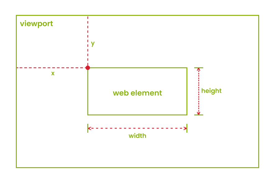
The foundation of our mini framework designed for responsiveness testing revolves around the location of elements. To put it simply, we require two essential pieces of information: the coordinates and size of the element. The good news is that obtaining this information is relatively easy, and most UI testing frameworks support it. With this crucial data, our framework can perform various responsiveness tests on the element to ensure that it performs optimally across different screen sizes and resolutions.
For this blog post, we have decided to use JavaScript and WebdriverIO. One way to obtain the required data is by using the getLocation and getSize methods.
The getLocation method returns two coordinates of the element. The first coordinate represents the horizontal distance between the top-left corner of the element and the viewport of the browsing context. The second coordinate represents the vertical distance between the top-left corner of the element and the viewport of the browsing context. On the other hand, the getSize method returns the width and height of the element.


We will create a class that contains all the responsive testing utility methods, which we can later extend in any page class to utilize responsive testing.
In the utility class, we can add a method that returns an object with the data we described earlier. However, note that there are other ways to retrieve this information as well.
async getElementData(element) {
    const location = await element.getLocation();
    const size = await element.getSize();
    return {
        x: location.x,
        y: location.y,
        width: size.width,
        height: size.height,
    };
}
Another crucial mechanism we need to have to make the entire responsive testing idea functional is the ability to resize our browser at any time to trigger layout changes when certain breakpoints are reached.
This can also be achieved in different ways, and one possible solution is to modify the browser options in the wdio configuration file. However, we will create a simple method for this purpose, as we don't want to change the configuration parameters after each execution:
async resizeBrowser(width, height) {
    await browser.setWindowSize(width, height);
}
Before we dive into implementing methods for responsiveness testing, let's take a moment to consider a scenario:
Suppose we have two elements on our homepage that should swap positions when the website's width reaches a specific size. We wrote a validation method to check if the elements are in the correct positions relative to each other, but the test failed. The report only says that the test case failed, and upon manual inspection, everything seems fine.
What could help us in this situation? How about a screenshot taken at the exact moment the test failed, highlighting the elements being tested? It seems like a helpful addition to our testing strategy.
async takeScreenshot() {
    const timestamp = new Date().toISOString().replace(/:/g, "-");
    const fileName = `screenshots/screenshot-${timestamp}.png`;
    const screenshot = await browser.takeScreenshot();
    fs.writeFileSync(fileName, screenshot, "base64");
}
In the above method, we first take the current timestamp and append it to the file name of the screenshot. By doing this, we will always have a unique name for our screenshots that will prevent any overwriting. Next, we take a screenshot with the takeScreenshot method and save it to our screenshots folder using the node fs module.
In order to display some text above the elements under test, we'll implement a method that takes in the desired text and element to be displayed with it. This method will create a div element that is absolutely positioned above the element under test, and will then append it to the DOM:
async addTextAboveElement(element, text) {
    await browser.execute(
        (el, txt) => {
        const div = document.createElement("div");
        div.innerHTML = txt;
        div.style.position = "absolute";
        div.style.top = el.getBoundingClientRect().top - 20 + "px";
        div.style.left = el.getBoundingClientRect().left + "px";
        div.style.color = "red";
        document.body.appendChild(div);
        },
        element,
        text
    );
}
We will use the same technique that we used in the layout testing methods to add a border to our elements.
The validation methods
Okay, we have our base methods. Now, it's time to write some code that performs the actual validation.
For example, let's say we want to create a method that checks whether an element is positioned to the right of another element. How can we accomplish this?
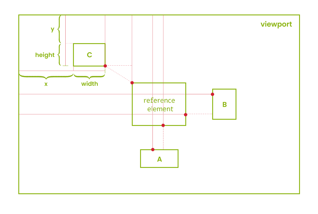
If it sounds difficult, let's take a moment to look at this image:


Looking at the image, it's quite easy to see the conditions that need to be met for each validation to pass. For example, when we look at the reference element and element B, we can see that in order for element B to be on the right side of the reference element, its x value needs to be higher than the sum of the reference element's x value and its width.
To begin with, we need to verify whether our elements are displayed on our website. If they are not displayed, there is no point in continuing with the validation process:
async verifyElementOnTheRight(elementOnTheRight, elementOnTheLeft) {
    if (
        (await elementOnTheRight.isDisplayed()) &&
        (await elementOnTheLeft.isDisplayed())
    ) {
        //validate element position
    } else {
        throw new Error("Provided elements are not displayed!");
    }
}
If the required elements are displayed, we will retrieve their locations using the getElementData method and perform the assertion within a try/catch block:
const elementOnTheRightData = await this.getElementData(
    elementOnTheRight
    );
    const elementOnTheLeftData = await this.getElementData(elementOnTheLeft);
    try {
    expect(elementOnTheRightData.x).toBeGreaterThan(
        elementOnTheLeftData.x + elementOnTheLeftData.width
    );
    } catch (error) {
    //take screenshot
}
In case the assertion fails, we will add a border and some text to our elements and take a screenshot:
await browser.execute(
    (firstEl, secondEl) => {
        firstEl.style.border = "3px solid red";
        secondEl.style.border = "3px solid red";
    },
    elementOnTheRight,
    elementOnTheLeft
    );
    await this.addTextAboveElement(
    elementOnTheRight,
    "Element on the right"
    );
    await this.addTextAboveElement(elementOnTheLeft, "Element on the left");
    this.takeScreenshot();
And that's it! By following this approach, we can add all types of layout validations. For example, to verify if an element is above another one, we can use the same approach, and our method would look like this:
async verifyElementIsAbove(elementAbove, elementBelow) {
    if (
        (await elementAbove.isDisplayed()) &&
        (await elementBelow.isDisplayed())
    ) {
        const elementAboveData = await this.getElementData(elementAbove);
        const elementBelowData = await this.getElementData(elementBelow);
        try {
        expect(elementAboveData.y + elementAboveData.height).toBeLessThan(
            elementBelowData.y
        );
        } catch (error) {
        await browser.execute(
            (firstEl, secondEl) => {
            firstEl.style.border = "3px solid red";
            secondEl.style.border = "3px solid red";
            },
            elementAbove,
            elementBelow
        );
        await this.addTextAboveElement(elementAbove, "Element above");
        await this.addTextAboveElement(elementBelow, "Element below");
        this.takeScreenshot();
        }
    } else {
        throw new Error("Provided elements are not displayed!");
    }
}
To use these methods, we can extend our page class with the utility class and add a method that calls all the required assertions. For example, for the 768px breakpoint, The Green Report homepage would use a validation similar to this one:
async verifyThirdBreakPointHomepageLayout() {
    await this.resizeBrowser(767, 1080);
    await this.verifyElementIsAbove(
        await this.latestNewsBanner,
        await this.firstFeaturedArticle
    );
    await this.verifyElementIsAbove(
        await this.firstFeaturedArticle,
        await this.secondFeaturedArticle
    );
    await this.verifyElementIsAbove(
        await this.secondFeaturedArticle,
        await this.thirdFeaturedArticle
    );
    await this.verifyElementIsAbove(
        await this.thirdFeaturedArticle,
        await this.randomArticlesSection
    );
}
And the spec file that tests all breakpoints could be similar to this:
const Homepage = require("../pageobjects/homepage");

describe("Responsive Layout Verification", () => {
    it("Verify responsive layout for 1920x1080 resolution", async () => {
    await Homepage.navigateToHomepage();
    await browser.pause(3000);
    await Homepage.verifyFullSizeHomepageLayout();
    });

    it("Verify responsive layout for 1500px breakpoint", async () => {
    await Homepage.verifyFirstBreakPointHomepageLayout();
    });

    it("Verify responsive layout for 1024px breakpoint", async () => {
    await Homepage.verifySecondBreakPointHomepageLayout();
    });

    it("Verify responsive layout for 768px breakpoint", async () => {
    await Homepage.verifyThirdBreakPointHomepageLayout();
    });

    it("Fail validation test with screenshot", async () => {
    await Homepage.screenshotVerification();
    });
});
Conclusion
Using the aforementioned approach, we can effortlessly extend any UI framework with additional support for responsive testing. The pattern for writing various types of validations is easy to comprehend, and having this kind of validation provides additional benefits:
Accuracy: Validating the position and size of elements using their coordinates ensures that the layout of the website is correct at various breakpoints.
Flexibility: Testing responsive design using element coordinates provides flexibility as developers can test any element on the website, regardless of its type or position.
Debugging: When automated tests fail, developers can easily identify the exact element and breakpoint that caused the failure, which makes debugging much easier and faster.
Time and cost-effective: Testing responsive design using element coordinates and sizes can save time and costs by reducing the need for manual testing and increasing testing accuracy.
As always, you can find the full code examples on our GitHub repository. Enjoy!